Using Xstate with inputs in React
import BlogPostImage from “~components/BlogPostImage.astro”;
In this blog post, I want to present how you can use XState to make styling inputs in React which are easier to maintain.
You can find the code on codesandbox.
Before you start reading this tutorial I recommend to read about state machines on statecharts.github.io. Also, Geddski blog post is a good place to start.
Problem
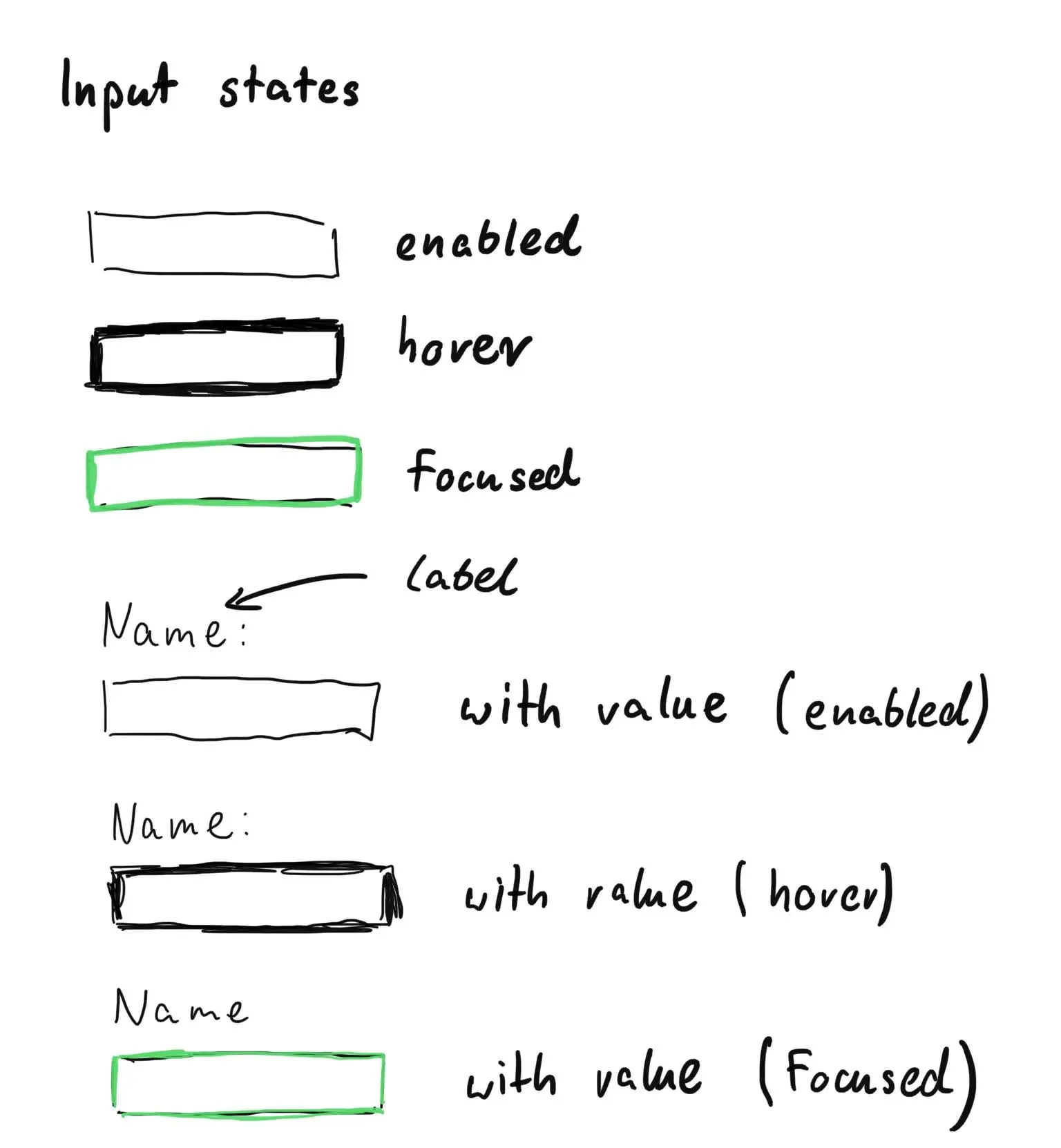
Imagine that you work on new inputs for the company website. Designers handle you an instruction how the input should look like:

In the picture above there are possible states of that input.
You start implementing designs but you quickly realize that something is wrong: you started seeing
a lot of similar flags in your code: isFocused && !isHover && !hasValue.
There is nothing wrong with those feature flag except one thing - you can easily mix up different states and end up with an impossible input state.
How can you do better?
Solution
What if you can use a different approach and have only one source of truth with the ability to prevent impossible states from happening?
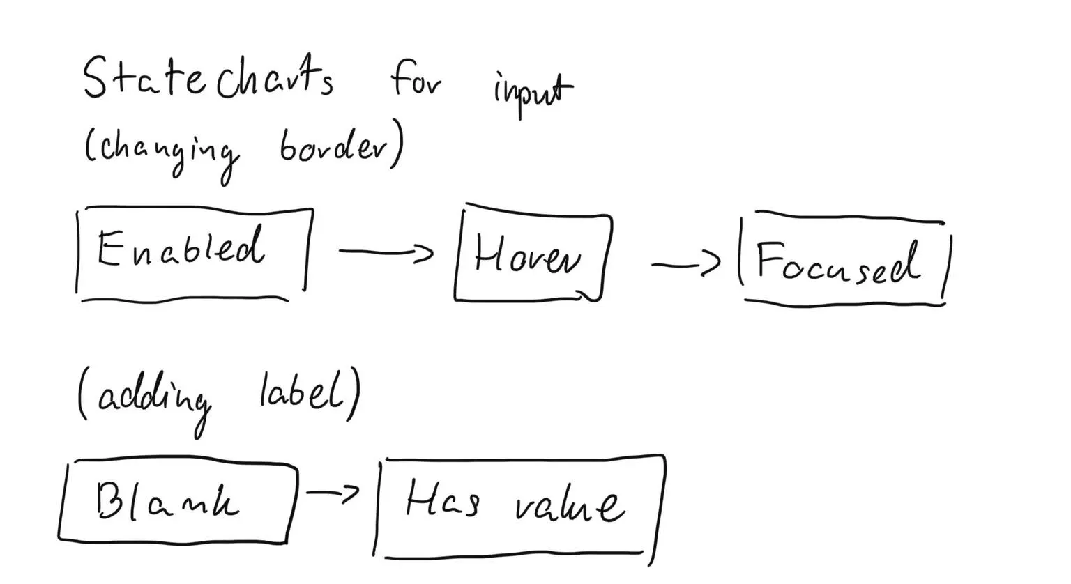
Let me introduce you to Xstate. As you may notice we are going to use statecharts to represent input logic. Let’s draw one:

We gonna have two parallel state machines:
- First one for changing the border of the input.
- The second one for displaying or hiding the input label.
Input state machine
Let’s start with the first one: changing the border. To use xstate you need to first initialize state machine.
I will do it with input states:
import { Machine } from "xstate";

const inputMachine = Machine({
  initial: "enabled",
  states: {
    enabled: {},
    hover: {},
    focused: {},
  },
});
Let’s add possible transitions between states:
import { Machine } from "xstate";

const inputMachine = Machine({
  initial: "enabled",
  states: {
    enabled: {
      on: {
        ENTER: "hover",
      },
    },
    hover: {
      on: {
        ENTER: "focused",
        EXIT: "enabled",
      },
    },
    focused: {
      on: {
        EXIT: "enabled",
      },
    },
  },
});
I’ve added there possible transitions:
- enabled => hover
- hover => focused
- hover => enabled
- focused => enabled
You can change the names of transitions (ENTER or EXIT) - it’s important
to be consistent because you are going to use them later.
Xstate comes with visualizer so you can generate state machine diagram by yourself:

You can also use this link.
Xstate context
We have transitions ready - now the question of what is changing during those transitions?
In this case, is the border of input.
I could add logic behind calculating the border to render of my component but I prefer to keep
it inside the state machine. For that I need context:
import { Machine, assign } from "xstate";

const inputMachine = Machine({
  initial: "enabled",
  context: {
    border: "1px solid #e6e6e6",
  },
  states: {
    enabled: {
      on: {
        ENTER: {
          target: "hover",
          actions: assign({
            border: () => "1px solid #cccccc",
          }),
        },
      },
      entry: assign({ border: () => "1px solid #e6e6e6" }),
    },
    hover: {
      on: {
        ENTER: {
          target: "focused",
          actions: assign({ border: () => "3px solid #56dcd1" }),
        },
        EXIT: "enabled",
      },
    },
    focused: {
      on: {
        EXIT: "enabled",
      },
    },
  },
});
Inside the context object, I put my initial border value. To change it, I used my previously defined transitions.
In Xstate there is a way to trigger actions when state machine transitioning from one state to the other.
This is an actions property on the ENTER object.
For example: on transitioning from enabled to hover I assign border to a new value. In the definition of enabled state, there is also entry property - this is a neat way of resetting border to its initial value when the state machine is entering enabled state.
This is how it looks like in visualizer:

Label state machine
I have inputMachine ready but I need one more piece of functionality - the ability to show and hide
label based on input having value.
I decided that it will be different state machine:
const labelMachine = Machine({
  initial: "blank",
  context: {
    opacity: 0,
  },
  states: {
    blank: {
      on: {
        ENTER: { target: "value", actions: assign({ opacity: () => 1 }) },
      },
      entry: assign({ opacity: () => 0 }),
    },
    value: {
      on: {
        EXIT: "blank",
      },
    },
  },
});
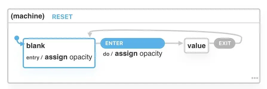
The logic here is the same as in the previous example but I have changed opacity
on state transitions. Diagram also looks the same:

Xstate + React
I have machines ready - now it is the time to use them in React component:
import { useMachine } from "@xstate/react";

function App() {
  const [value, setValue] = React.useState("");
  const [currentInputState, transitionInputState] = useMachine(inputMachine);
  const [currentLabelState, transitionLabelState] = useMachine(labelMachine);

  return (
    <>
      <div>
        <label
          htmlFor="name"
          style={{
            // rest of styles here
            opacity: currentLabelState.context.opacity // take current value from context
          }}
        >
          Name:
        </label>
        <input
          style={{
            // rest of styles here
            border: currentInputState.context.border // take current value from context
          }}
          id="name"
          value={value}
          onChange={event => {
            transitionLabelState("ENTER");
            setValue(event.target.value);
          }}
          onMouseEnter={() => transitionInputState("ENTER")}
          onMouseLeave={() => {
            if (!currentInputState.matches("focused"))
              transitionInputState("EXIT");
          }}
          onClick={() => {
            transitionInputState("ENTER");
            transitionLabelState("ENTER");
          }}
          onBlur={() => {
            transitionInputState("EXIT");
            if (!value) transitionLabelState("EXIT");
          }}
        />
      </div>
  );
}
To get access to the state of machine and transition it to different states you need to use useMachine hook.
It takes machine itself as an argument.
To trigger transition I’ve used transitionInputState & transitionLabelState which take events name (it this case ENTER & EXIT).
The rest of logic is to handle different HTML events on input and transition` them to different states.
Summary & TL;DR
In this blog post, I showed how to implement logic around changing input borders and labels with Xstate.
You can find code (with TypeScript types) on this codesandbox.
What is your take on state machines? Do you like this short introduction to xstate with React? Let’s write in comments.